

As a photographer, your website is your digital business card. It is the only place on the internet where you have full control over how your work is presented.
Yet you often see photographers struggling with the balance. Either the site is beautiful but impossibly slow, or it works technically fine but lacks any form of atmosphere.
In this article, I will show you 9 examples of photography websites that do it right. I will also explain how you can set up such a site yourself. The good news is that you don’t need an expensive designer for this. With the right tools, you can have a beautiful photography portfolio website online in no time that is both functional and loads quickly.
9 examples of beautiful photography websites
1. Anup Shah
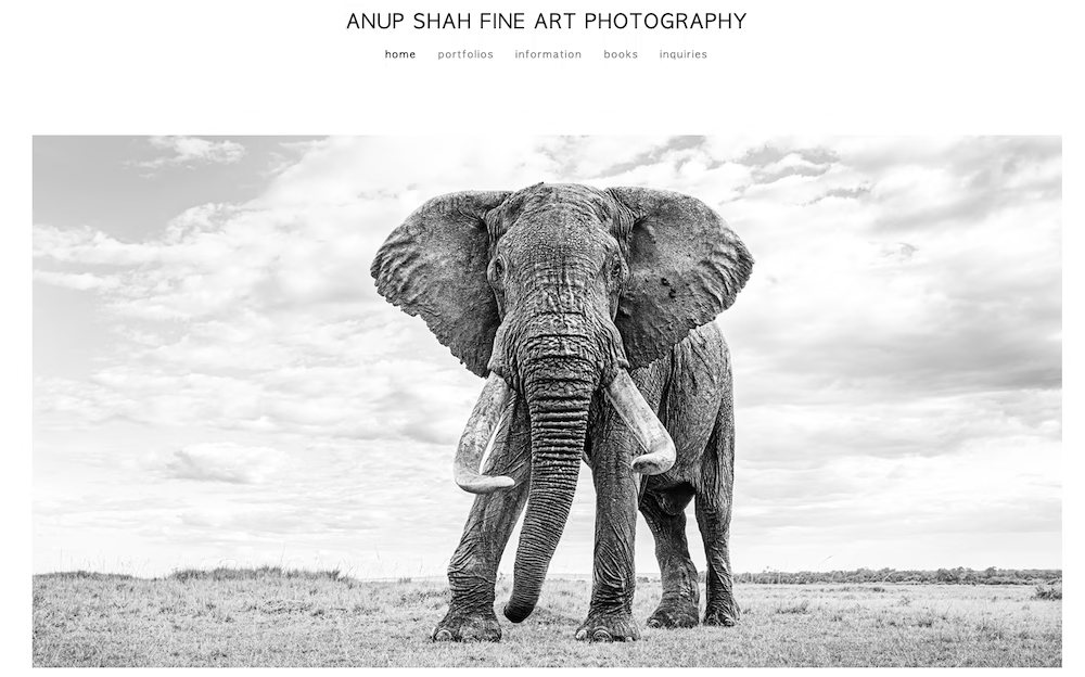
Focus: Black and white wildlife photography
Anup Shah shoots stunning black and white wildlife photos. His website is extremely minimalist and lets the photos speak for themselves. He uses a sleek grid system where the white space is just as important as the photos themselves. This gives you, as a viewer, the peace to really take in the textures in his wildlife photography. Like his photography, his website is also black and white.
Main lessons:
- White space allows your work to breathe. Don’t be afraid to use it.
- An effective photography site needs very few design elements.
2. Elia Locardi
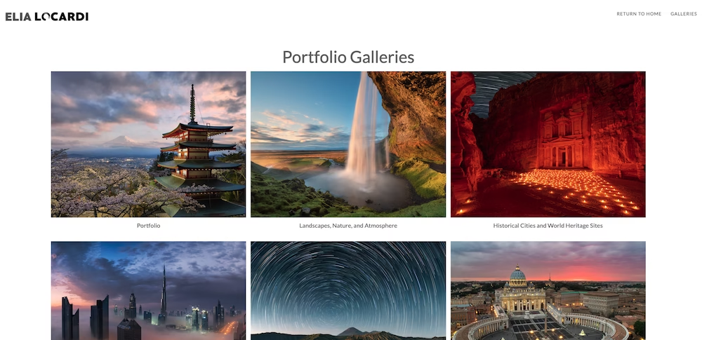
Focus: Travel & Landscape
Where Shah opts for calm, Elia Locardi opts for impact. As soon as you open the site, you are greeted by full-screen sliders. This works perfectly for landscape and travel photography. You are immediately drawn into the location as a visitor.
Main lesson:
- Do you have spectacular landscapes? Use the full width of the screen.
3. Tina & Flo
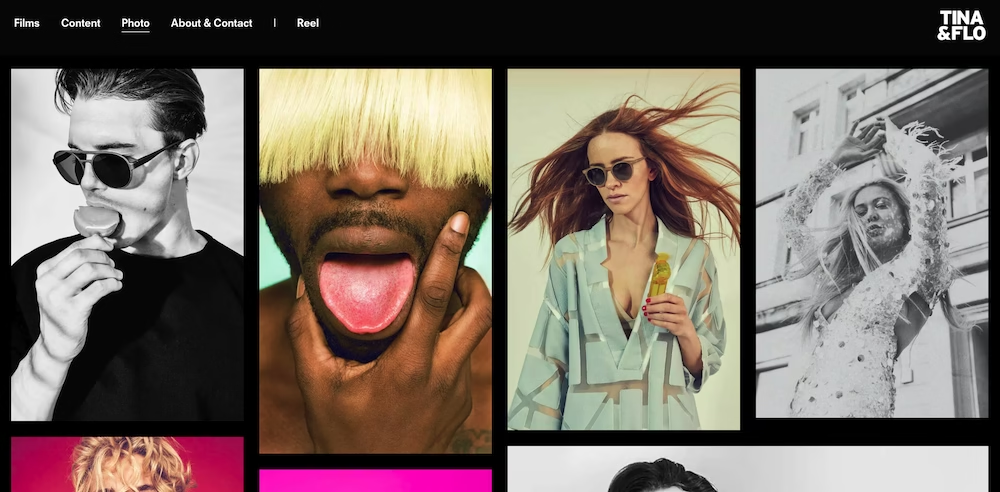
Focus: Branded content & commercials
This duo opts for an editorial approach. The site doesn’t feel like a standard portfolio but more like a high-end magazine. The typography is elegant, and the layout is playful. A lot of moving image is used (in addition to photography, the duo also shoots videos). All of this makes exploring this site a stimulating and captivating experience.
Main lessons:
- Your branding (fonts, colors) must match the emotion of your photos.
- A black background can instantly give your photography site a high-end vibe.
4. Brett Stanley
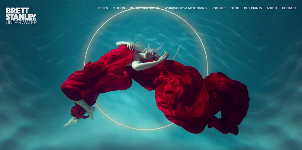
Focus: Underwater photography
Stanley works underwater, and his website reflects that perfectly through the use of a dark background. This makes the colors of his subjects pop off the screen, and you get that sense of depth.
Main lessons:
- A dark background can make colors more intense and enhance mood.
- A full-screen photo slider (with zooming in and out effects) is an effective way to capture your visitors’ attention.
5. Brandi Toole
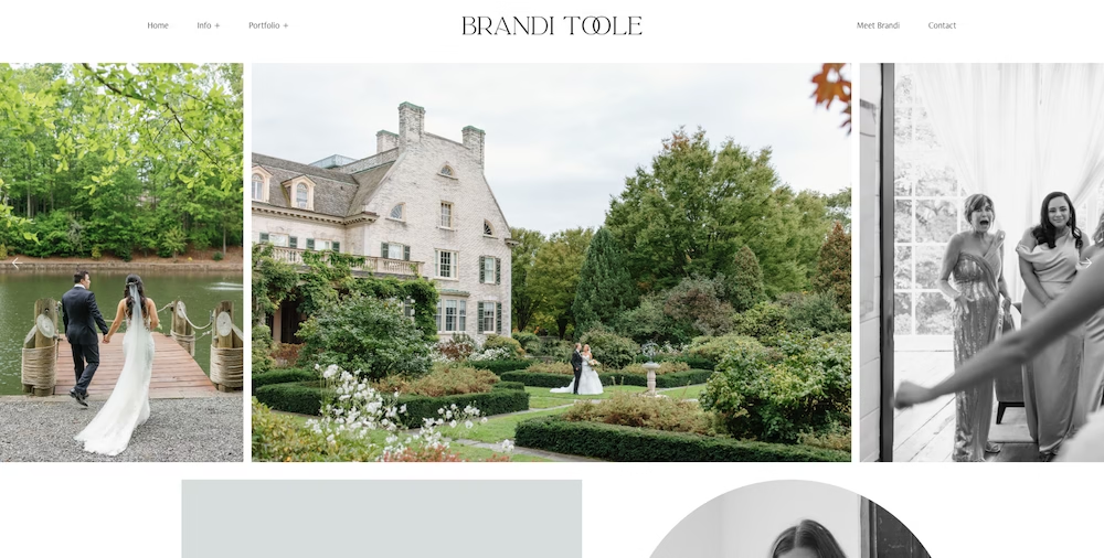
Focus: Wedding & lifestyle
No tight grids here, but a collage-like approach. It feels personal, warm, and accessible. Exactly what you want to convey when photographing people at their most intimate moments.
Main lesson:
- Perfection is not always necessary. A playful layout shows character.
6. Amy Lombard
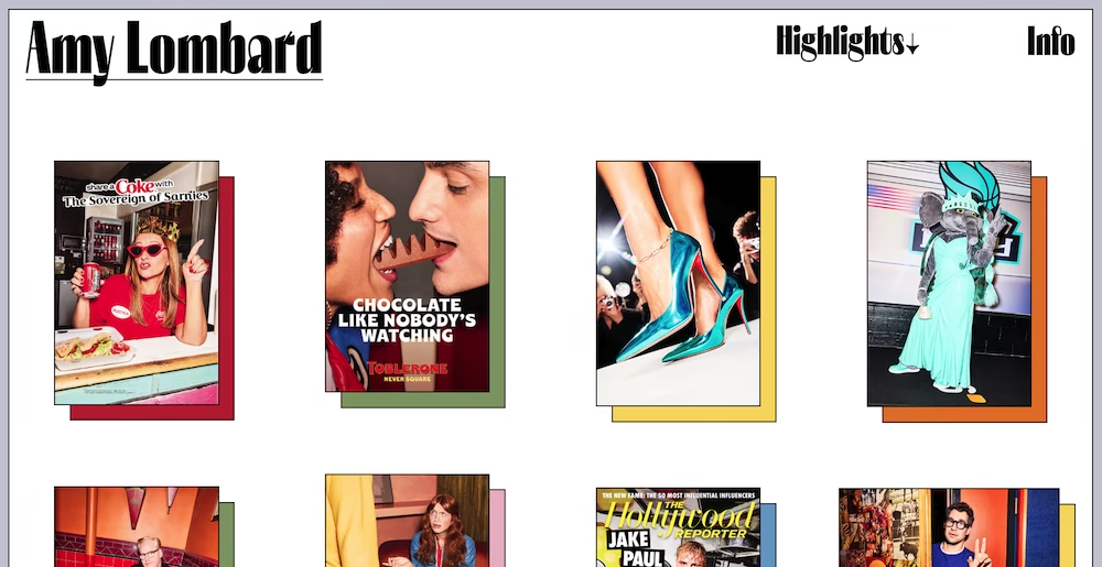
Focus: Documentary & Pop-culture
Amy’s work is bold, hard, and unique. Her website ignores the standard “minimalistic” rules and uses bright colors in the navigation that perfectly match her hard flash style. It is bold and unconventional.
Main lessons:
- Don’t be afraid to go against the grain if it suits your style.
- A combination of static photos and moving images on a single page is a smart way to capture attention.
7. Lieben
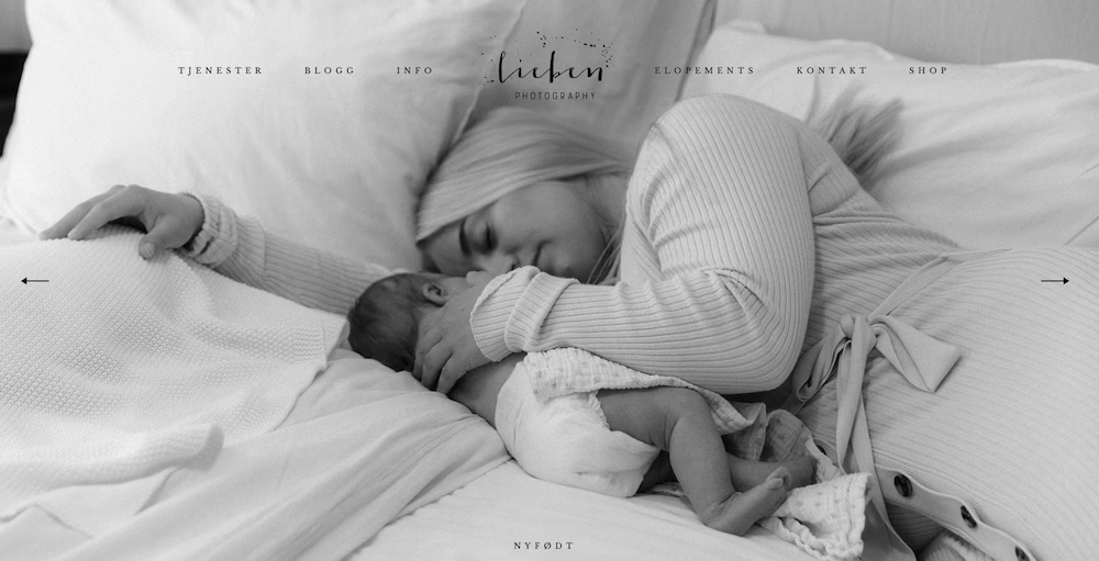
Focus: Family photography
Lieben is a Scandinavian photography website that offers an interesting glimpse into Norwegian family life. The site perfectly matches the target audience. It is warm, accessible, and welcoming. The site is also very sparing in the elements it uses.
Main lesson:
- Ask yourself for each element on your site: “Is this really necessary?”
8. Heather DeCamp
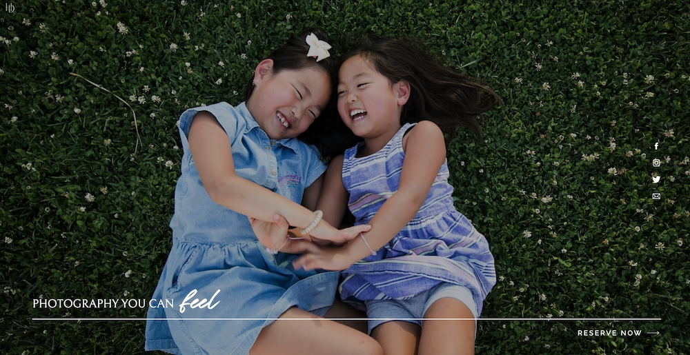
Focus: Family
Accessible and cheerful. Heather makes smart use of clear call-to-actions (buttons) and ensures visitors don’t get lost. The portfolio plays the leading role, but she is business-minded and often prompts the visitor to get in touch.
Main lesson:
- Make it easy for your customers to book you.
9. Ivskaya
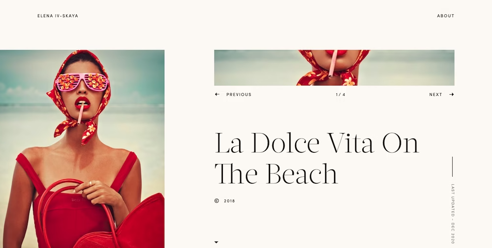
Focus: High Fashion & Beauty
This site almost functions as an interactive artwork. Avant-garde, graphic, and sleek. The blocky layout and use of color enhance the fashion feel.
Main lesson:
- Your website is part of your art form.
This is how you create a photography website
From inspiration, we now move on to execution. Many photographers think of Squarespace or Wix for creating their websites. They are great tools, but they are also incredibly expensive, and you never truly own your site.
This is how I would build my own photography website:
Step 1: The platform (choose WordPress)
WordPress is the industry standard, and for good reason (almost half of all websites run on WordPress). It is free open-source software, which means you have full control. There are thousands of themes and plugins created especially for photographers.
The main advantages of WordPress:
- You are not stuck with monthly “rent” of the platform.
- You have complete freedom regarding the appearance of your website.
- Endless possibilities to optimize your SEO (important to be found).
Step 2: Hosting and domain name
WordPress is free, but you still need to host your site somewhere. That’s where web hosting comes into play. You can get a hosting package from a few euros per month and install WordPress within a few clicks.
As a Dutch photographer you can look at my.host.

Why my.host?
- Speed: Fast LiteSpeed servers optimized for heavier sites.
- Price/quality: Low (and equally important, stable) prices, while still having access to the latest hardware.
- Support: Simply good Dutch support. Very pleasant if you need help.
Step 3: Installation and theme
Almost every host (including my.host) offers a “1-click installation” for WordPress. Then you need to choose a suitable WordPress theme. A free theme will suffice in many cases.
There are plenty of good themes. For most of my own websites, I use Kadence. Very practical is that they offer a special module for a photography portfolio, as well as countless tools like sliders.
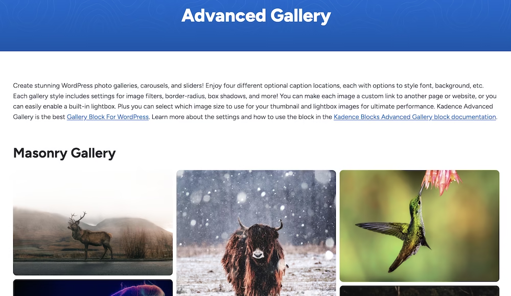
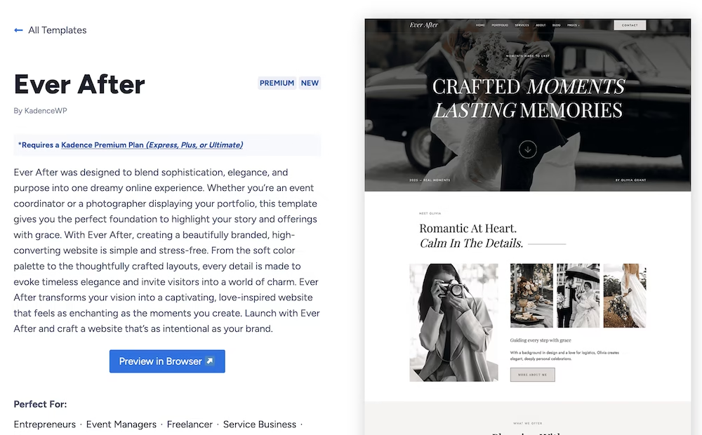
Additionally, they also offer starter templates specifically aimed at photographers.
Things to consider (checklist)
Before going live, go through these points. This is the difference between a hobby site and a professional portfolio.
- Speed & compression. Never upload your raw files or full-res JPEGs of 20MB.
- Reduce the resolution (for example, max 2500px wide).
- Use tools like TinyJPG or a plugin to compress files.
- Preferably use the WebP format. It is smaller and faster than JPEG. You can do this via the free LiteSpeed Cache plugin.
- Curate: kill your darlings. This is painful, but necessary. Show only your very best work. Visitors will not click through 500 photos. A portfolio with 20 amazing shots is stronger than a portfolio with 20 amazing and 50 “fine” snapshots.
- Navigation. Keep it simple. People are usually looking for three things:
- Your work (Portfolio)
- Who are you? (About me)
- How can I reach you? (Contact) Do not hide your contact information.
- Check how mobile-friendly your site is. More than half of your visitors view your site on a phone. Check if your photos scale well and if texts remain readable. What looks beautiful on a 27-inch iMac can look like an unreadable piece on an iPhone.
Conclusion
A strong website enhances your work and lets you book more clients. Start simple, focus on the quality of your images, and choose a stable foundation with WordPress and good hosting like my.host.



Leave a Reply