
The role of typography in web design is significant. It not only determines how your content looks but also how visitors experience your brand and whether they keep reading or click away. Early in my website development career, I consistently chose system fonts (out of convenience and because they load slightly faster than custom fonts), but these days I spend a lot of time choosing the right fonts for every website.
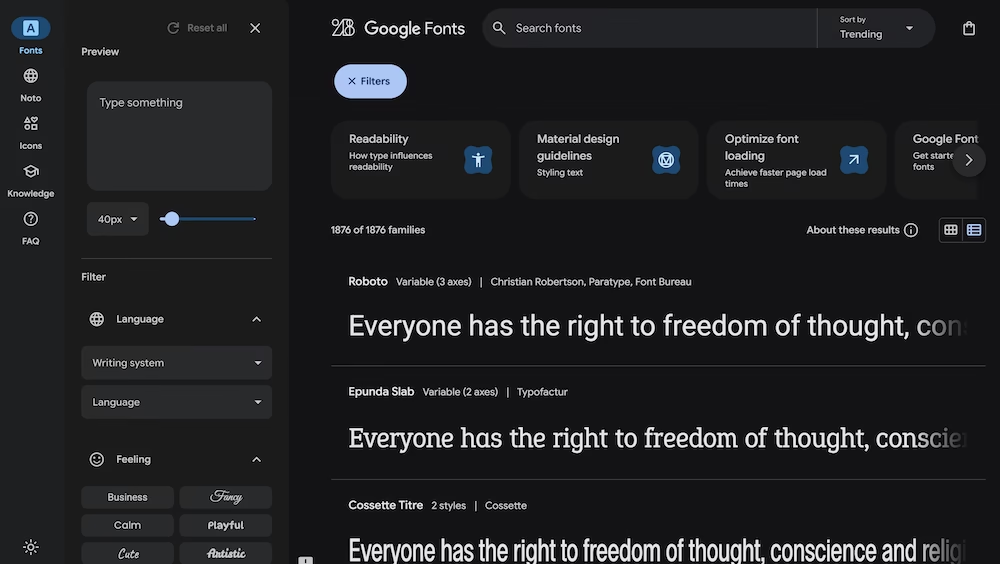
For my part, I always turn to Google Fonts. The collection of over 1,400 free, open-source fonts makes beautiful typography accessible to everyone. The best part is that it’s completely free and requires no complicated installations. A CMS like WordPress makes it super easy to use.
This year, we see an intriguing mix in the popularity of Google Fonts. On one hand, reliable, readable choices like Roboto and Open Sans continue to dominate. On the other hand, more expressive fonts are growing in popularity – especially for headers and accents.
In this article, I’ll show you the top 15 most popular Google Fonts at the moment. You’ll get practical examples of where each font can be best used, plus concrete tips for implementation.
The top 15 most popular Google Fonts of 2025
1. Roboto
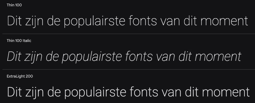
Roboto is a neo-grotesque sans-serif that has been the standard font for Android for years. It combines a modern, geometric base with friendly, organic elements. This balance makes it extremely versatile – it works equally well for a tech startup or a traditional company.
Best for: Body text, UI elements (buttons, menus), app design, corporate websites. Practically usable everywhere.
Why so popular: Has been the most used font on the web for years. It’s a safe, professional choice that always works.
2. Open Sans
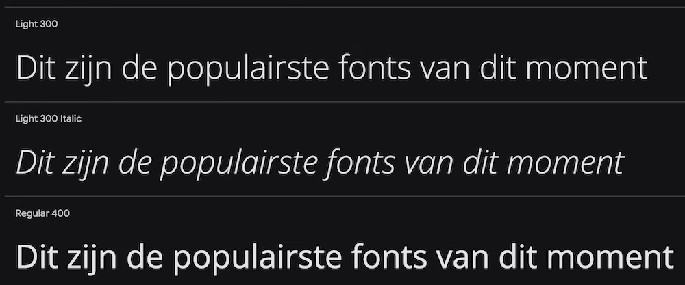
A humanistic sans-serif specifically designed for optimal readability on screens. Open Sans feels open, neutral, and friendly. Slightly less stiff than Roboto but equally reliable.
Best for: Longer pieces of text (blogs, articles), corporate websites where readability is the top priority.
Why so popular: Has excellent readability and a neutral character that fits any brand identity.
3. Montserrat
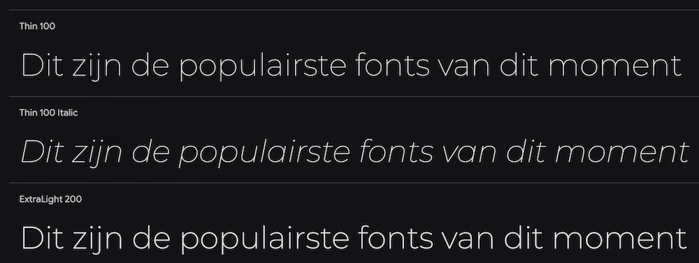
A geometric sans-serif inspired by old posters from the Montserrat neighborhood in Buenos Aires. It has an urban, stylish, and modern look that stands out immediately.
Best for: Headers, short pieces of text, logos, branding. Perfect if you want to exude a design feel.
Why so popular: Hugely popular in the design world for a modern, slightly artistic look that remains professional.
4. Lato
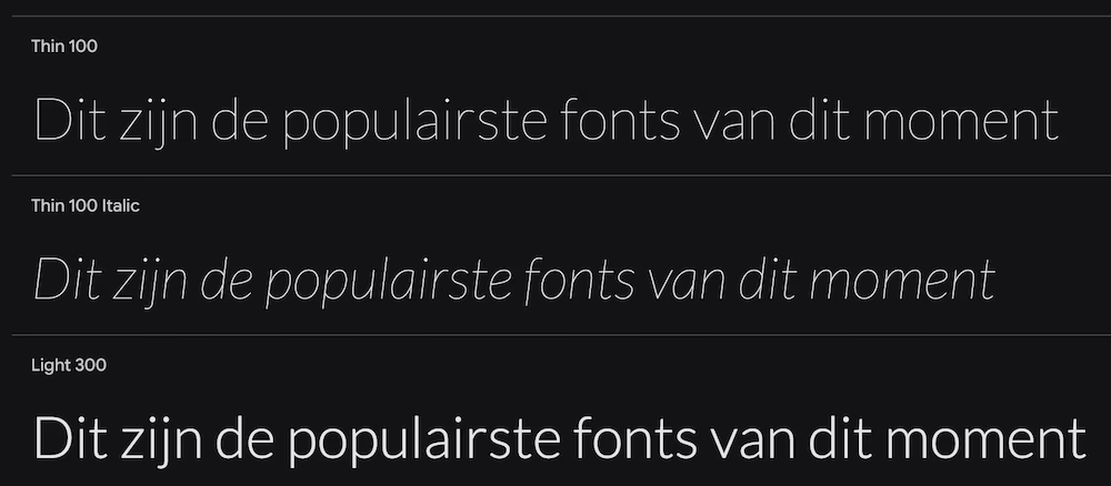
A sans-serif that finds a perfect balance between serious and friendly. “Lato” means “summer” in Polish, and that warm, harmonious feeling is also conveyed by the font.
Best for: Both body text and headers. Ideal for companies that want to appear professional yet approachable.
Why so popular: That “serious but friendly” vibe makes it widely usable for various audiences.
5. Poppins
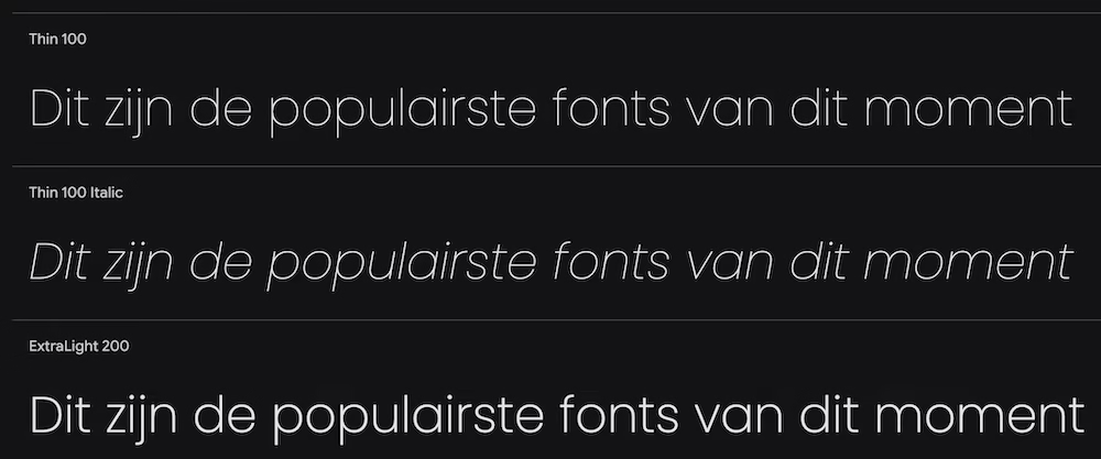
One of the younger fonts in the top 15. Poppins is a geometric sans-serif with perfectly round shapes. It exudes modernity. Playful yet sleek and polished.
Best for: Tech startups, modern websites, headers, UI design. Excellent for a fresh, young look.
Why so popular: Quickly risen in popularity due to its clean and modern look that perfectly aligns with contemporary design trends.
6. Inter
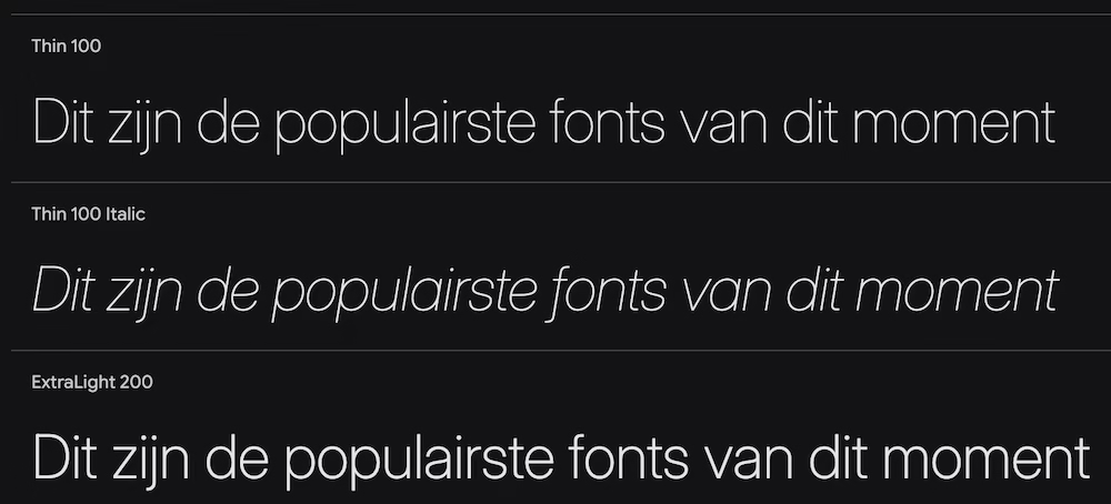
Specifically designed for user interfaces (UI) with an extreme focus on readability at small sizes. Inter is neutral, functional, and fades into the background. Exactly what you want for interface text.
Best for: UI/UX design, dashboards, apps, and all text on an interface.
Why so popular: The standard for many UI designers because of its wide functionality.
7. Raleway
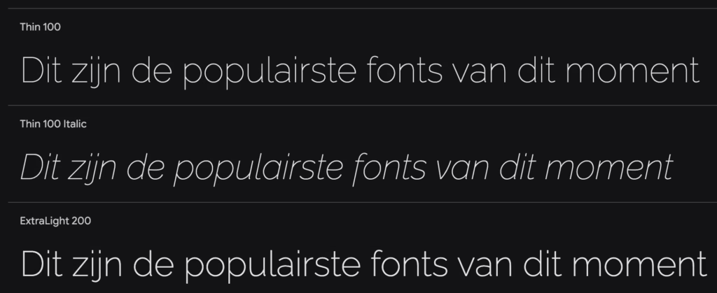
An elegant sans-serif with a light and airy feel. Raleway has some stylistic features (like the distinctive ‘W’) that give it character without being distracting.
Best for: Large headlines, titles, portfolios, fashion and lifestyle websites.
Why so popular: The elegant appearance makes it a favorite for designers who want a bit more personality than standard fonts.
8. Playfair Display
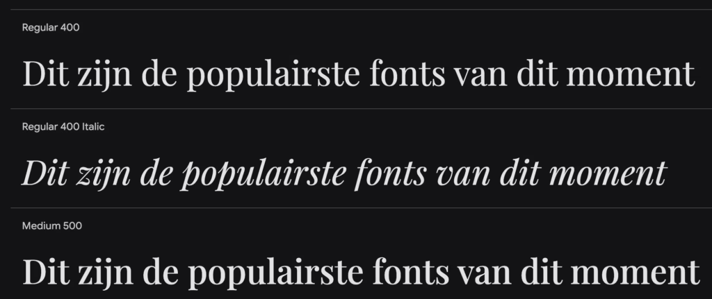
A traditional, high-contrast serif typeface that feels elegant, dramatic, and luxurious. Inspired by typefaces from the 18th century but fully optimized for modern screens.
Best for: Large, impactful headlines, quotes. Perfect for editorial content, fashion, and luxury brands.
Why so popular: The go-to font for anyone wanting to add a touch of classic elegance.
9. Oswald
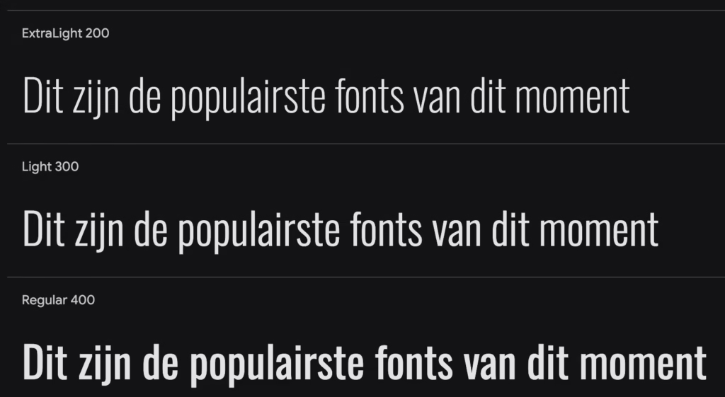
A ‘condensed’ (narrow) sans-serif that is impactful and space-saving. Inspired by classic ‘Alternate Gothic’ typefaces from the early 20th century.
Best for: News headlines, banners, menus – anywhere you want high impact with limited space.
Why so popular: Its narrow and powerful appearance fits perfectly with modern, sleek designs.
10. Merriweather
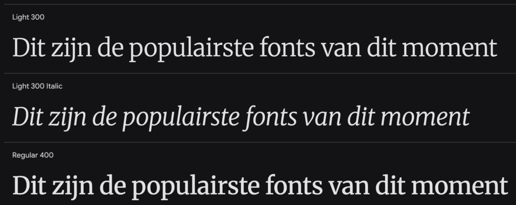
A serif typeface specifically designed for a pleasant reading experience on screens. Sturdy, traditional, and highly legible – even for longer texts.
Best for: Longer body text on blogs and news sites. The serif alternative to Open Sans.
Why so popular: One of the few serifs truly optimized for screen use and popular for body text.
11. Noto Sans
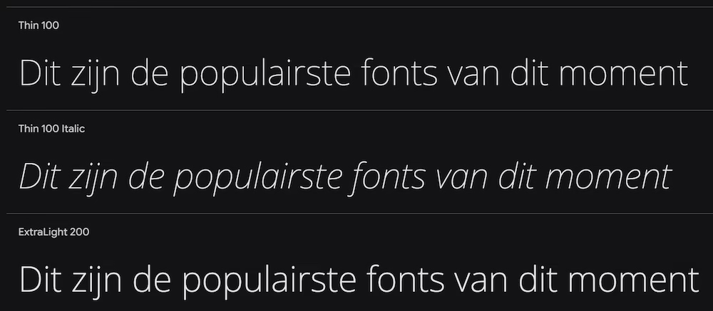
The most ambitious font by Google, designed to support all languages and scripts worldwide without empty blocks. Visually consistent and harmonious, no matter what language you use.
Best for: International websites, multilingual platforms, applications with user-generated content.
Why so popular: The universal language support makes it ideal for global projects.
12. Work Sans
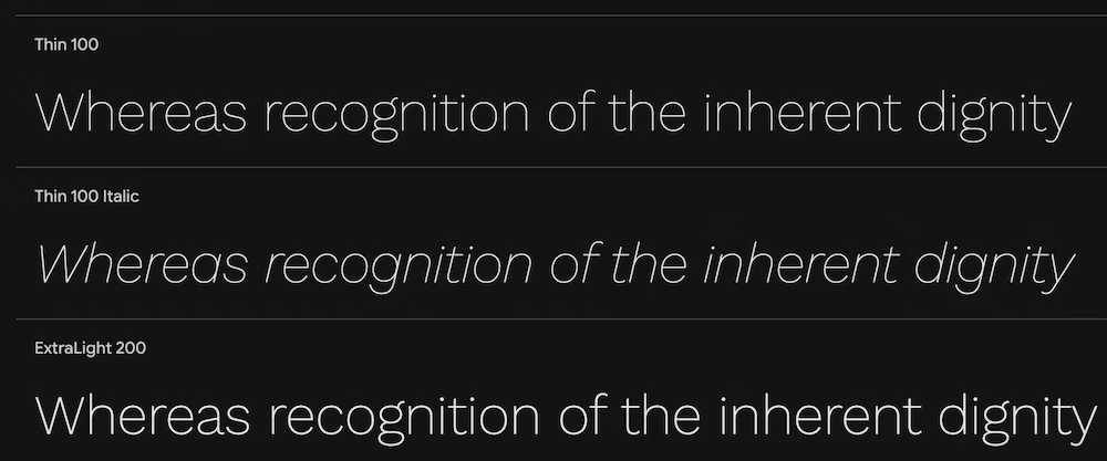
A sans-serif optimized for screen use, but with a slightly rougher, ‘grotesque’ character. It feels more informal and unique than the absolute top choices.
Best for: Websites of creative agencies, portfolios, and brands that want a ‘no-nonsense’ yet friendly appearance.
Why so popular: Rising quickly as a less ‘mainstream’ alternative to Roboto or Open Sans.
13. Source Sans 3
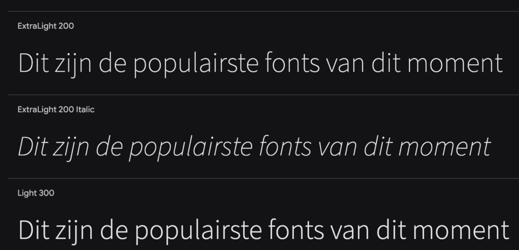
Adobe’s first open-source font, designed with UIs in mind. Very clear, professional, and excellently readable in all sizes.
Best for: Corporate environments, data-intensive applications, technical documentation.
Why so popular: Considered a professional choice by developers and designers.
14. Lora
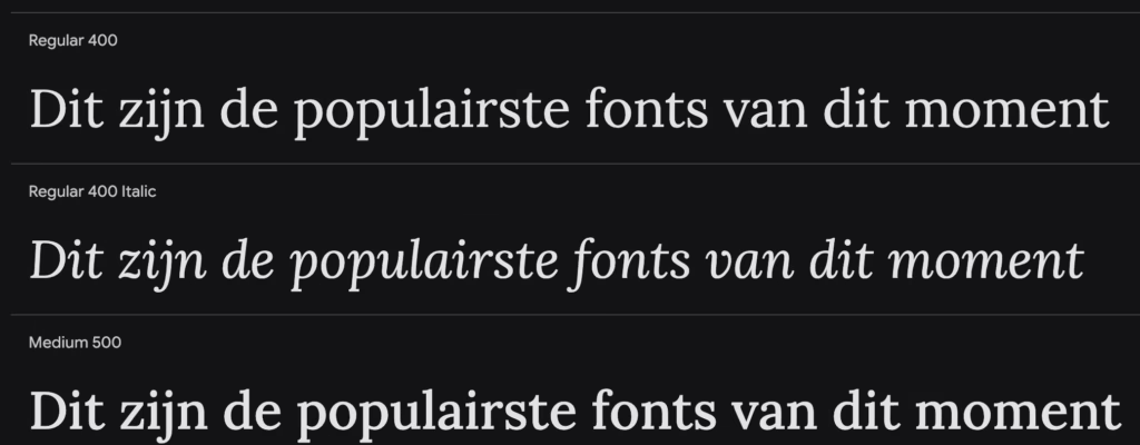
A well-balanced, modern serif typeface with roots in calligraphy. It combines elegance with friendliness. Less formal than traditional serifs.
Best for: Body text for narrative content, blogs, online magazines. Pairs well with sans-serif headings.
Why so popular: Popular for content that wants to convey an artistic and tasteful feel without being too heavy.
15. DM Sans

A geometric sans-serif with low contrast, specifically designed for smaller text sizes. It is clear and crisp on mobile screens.
Best for: Mobile interfaces, body text in web apps, and minimalist designs.
Why so popular: Gaining popularity for ‘mobile-first’ and minimalist designs where clarity is crucial. I personally use this font for several of my websites.
How to Use Google Fonts Effectively?
Font Combinations That Work
The basic principle of successful font combinations is contrast. Combine a serif with a sans-serif, or use a characterful display font for headings with a neutral font for body text.
Practical tools like Font Pair and the built-in suggestions of Google Fonts can help you get inspired. Google also provides recommendations for popular combinations with each font.
Optimize Speed and Performance
Limit the number of font weights: Each weight (Regular, Bold, Italic) is a separate file your browser needs to download. Limit yourself to a maximum of 3 variants to avoid slowing down load time.
Consider Variable Fonts: This modern solution uses a single font file containing multiple styles. It saves significantly on download time and gives more control over typography.
Local hosting versus Google’s servers: Google’s servers are fast, and fonts are often already cached in browsers. However, local hosting can still provide a small speed boost. Through a WordPress theme like Kadence, you can easily host your Google fonts locally.
Accessibility is Super Important
Always ensure sufficient contrast between text and background. The WCAG guidelines provide concrete values for accessible contrast ratios.
Tools like the Color Contrast Checker by WebAIM help you check if your color combinations meet accessibility requirements.

Leave a Reply