
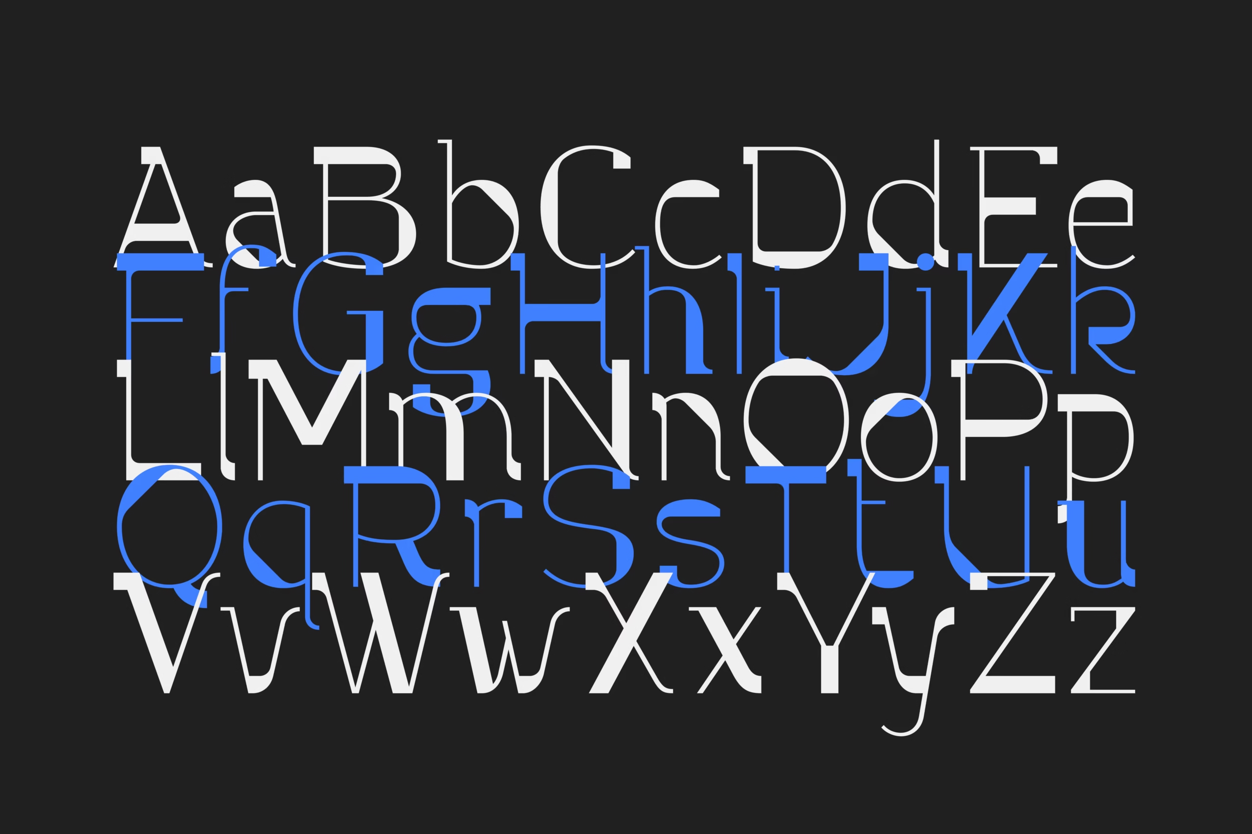

Selecting the right font for your website is a less simple task than it initially seems.
Choose a few fonts that you find aesthetically pleasing and slap them on your site? Not so fast.
Not every font is suitable for websites. And it’s not just about the visual aspect: randomly using fonts for your site can also lead to technical issues (more on this later).
After developing over 30 websites, I have a pretty good idea of what goes into choosing fonts for a website. In this concise article, you’ll read everything you need to know.
7 tips for choosing a font for your website
These are my top tips for choosing fonts for your site.
1. Readability above all
This might seem like a no-brainer. Yet you’ll surprisingly encounter many websites with fonts that are not very easy to read.
Creative-looking, flamboyant fonts may give your site a unique character. But as soon as readability is at stake, it’s wise to opt for something less adventurous.
Also, make sure that your font is at least 16 pixels in size (18 pixels, or even more, often works better).
And ensuring that the font is readable on every screen size (check your site on your phone as well) is very important.
2. Choose no more than two fonts
Choosing more than two fonts brings a few issues:
- Your site will look messy
- You’ll notice a negative impact on your website’s loading times
Select a font for your headings, and choose one for the “body” text (used in your paragraphs, etc.).
On many of my websites, I even stick to just a single font. I mostly choose this due to loading times. A second font won’t have a noticeable impact on your site’s speed, but for a speed enthusiast like myself, every millisecond counts.
3. Choose a font that matches your brand
Is your brand:
- Modern and minimalist? Then opt for a sans-serif font (for example, Lato, Open Sans).
- Elegant and professional? Serif would suit better (for example, Merriweather, Playfair Display).
- Creative and light? Display or script fonts might work (but, as mentioned above, keep an eye on readability!).
You would expect a different font on a yoga website than on the site of a law firm.
4. Create contrast by combining fonts
Here’s an example of a website I manage where I chose two highly contrasting fonts:
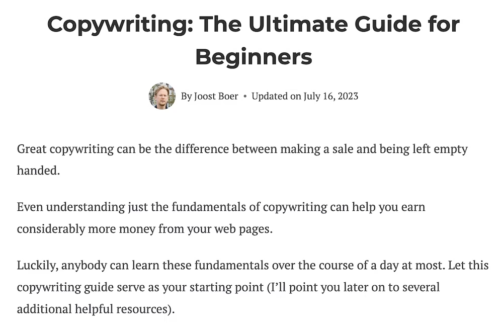
PT Serif for the body, and Montserrat for the titles.
The stylistic clash of these fonts works very well. When choosing two fonts, you don’t want them to look too much alike.
Later in this article, you’ll find more examples of fonts that pair well together.
EXTRA TIP: Every professionally designed website maintains a fixed ratio when it comes to different headings (H1, H2, H3, etc.) and the standard text. So, don’t choose the size of your different text types based on what “feels right.” A tool like Typescale can ensure that the size of your various text types is well-coordinated.
5. Review your font on different browsers and devices
Sometimes a font may not render well on a particular browser or device. Therefore, it’s crucial to test this thoroughly.
6. Pay attention to performance
Use so-called web safe fonts or fonts that are optimized for fast loading times.
Both Google Fonts and Adobe Fonts offer free, web-optimized fonts (you can read more about Google Fonts below).
7. Consider accessibility
Relating to the first point: the internet is also used by the visually impaired and elderly.
Especially for these groups, the accessibility of your website is very important.
Make sure that your font color contrasts strongly with the page background. And ensure your text isn’t too thin or elaborate.
My advice: use Google Fonts
As a website owner, I would always recommend using Google Fonts if possible. Here’s why:
- The selection is vast. With over 1,000 fonts, you should be able to find a suitable font for any project.
- Works well on all browsers and devices. Google fonts are web-safe, so you don’t have to worry about them looking off on a particular browser or gadget.
- Fast loading times. Google Fonts are hosted on Google’s lightning-fast servers.
- Easy to integrate. Google offers easy-to-follow instructions so you can get their fonts working on your site in no time.
- It’s free. You don’t have license fees like with some other fonts.
Are you using WordPress? Then you’re in luck. Many popular WordPress themes like Kadence and GeneratePress have Google Fonts integration.
I personally use Google Fonts on all my websites.
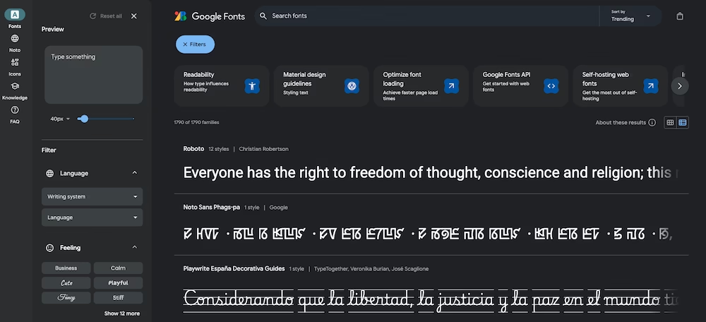
Finding out what font a website uses
Have you come across a website with a font you like? Here’s how you can see which font is used (in Chrome).
Select the text, right-click and choose Inspect. Scroll down in the window that appears under the Styles section, and eventually, you will find the font being used.
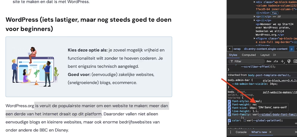
Examples of fonts that pair well together
If you want to use multiple fonts, you might try one of the following pairings.
| Title font | Body font | Why it works |
| Playfair Display | Lato | Classic and modern, elegant and readable. |
| Merriweather | Open Sans | Balanced and very readable for longer texts. |
| Roboto Slab | Roboto | Consistent, sleek appearance with a technical flair. |
| Oswald | Montserrat | Bold and geometric, ideal for modern websites. |
| Poppins | Source Sans Pro | Friendly, professional, and versatile. |
| Bebas Neue | Nunito | Strong headings with fluent, readable body text. |
| Raleway | Roboto | Elegant for titles and reliable for text. |
| Lora | Muli | Literary and modern, perfect for blogs. |
| Abril Fatface | Work Sans | Dramatic and striking, ideal for creative sites. |
| Dancing Script | Quicksand | Playful yet readable for artistic websites. |
With Google Fonts, you can compose even more font pairs.



Leave a Reply