


Creating websites and a sense of style, colors, and design. They go hand in hand. However, you don’t need to have a sense of web design to create a website. This is where the big risk lies. Choosing colors for a website is tricky.
Web design creates a first impression for your visitors. In many cases, it’s the decision whether they stay and take your website seriously (or not).
Having a sense for web design is not, as mentioned, a must for creating a website. But I do recommend at least familiarizing yourself with the basic principles.
And the use and choice of color deserves additional attention: it is exceptionally important for your website.
The first impression of a website is largely based on the use of color. In this article, I’ll show you which colors evoke emotions and how you can cleverly use them in your website.
The psychology of colors
Colors evoke emotions and associations deeply rooted in our psyche. Research shows that people make a judgment about a product within 90 seconds, and between 62% and 90% of that judgment is based solely on color.
What different colors communicate
- Red: Energy, passion, urgency, excitement. Red elements draw immediate attention and can increase heart rate. It is often used for call-to-action buttons and (discount) banners. On a website like MediaMarkt, you can see how red is used to evoke energy and create urgency.
- Blue: Trust, reliability, professionalism, calmness. Blue is a favorite among financial institutions and technology companies because it conveys trust. Think of websites like LinkedIn and the RijksOverheid.
- Green: Growth, health, nature, prosperity. Green is associated with health and sustainability. Websites in the healthcare, food, and environmental sectors often use green hues.
- Yellow: Optimism, cheerfulness, attention, warning. Yellow exudes positivity and draws attention. Snapchat, for example, uses yellow to create an optimistic, accessible atmosphere.
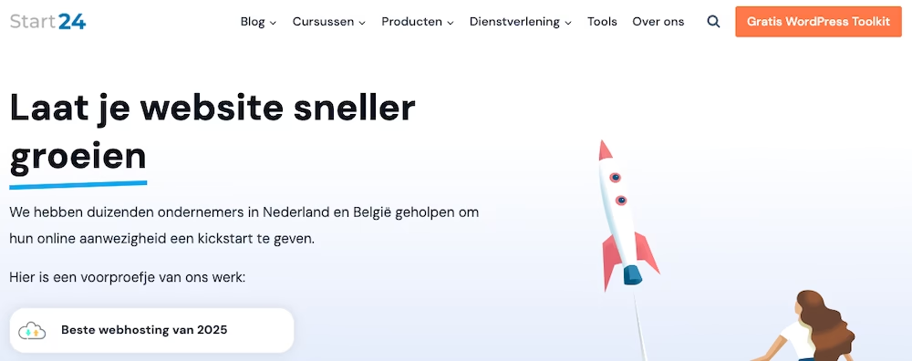
- Orange: Friendliness, enthusiasm, creativity, affordability. Orange combines the energy of red with the cheerfulness of yellow. It is often used by creative companies and for call-to-actions. Personally, I use it for the CTAs on every website I run.
- Purple: Luxury, wisdom, creativity, mystery. Purple is associated with luxury and exclusivity. Brands like Rituals and Milka use purple to convey a sense of premium quality.
- Black: Elegance, strength, luxury, authority. Black communicates good taste and exclusivity. Luxury brands like Chanel use black as the primary color in their branding.
- White: Purity, simplicity, minimalism, space. White creates space and tranquility. Apple is a perfect example of a brand that uses white to communicate simplicity and innovation.
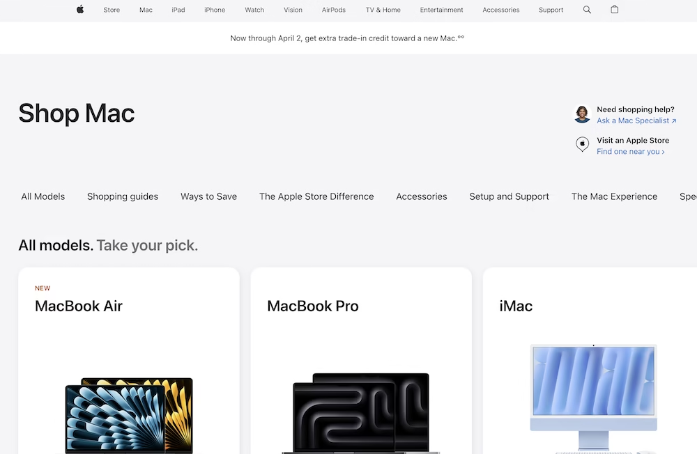
According to the study “Impact of Color in Marketing” by Satyendra Singh, color not only affects brand perception but can also increase conversion by up to 80% when applied strategically.
An example from my own experience: I keep the primary colors of my own websites fairly subdued, and then let the CTAs stand out sharply against them:
Your brand identity and color
Your choice of colors should directly align with what your brand wants to convey. This goes beyond aesthetics: it is a fundamental part of your brand identity.
Define your brand personality
Before choosing colors, you need to be clear about what personality your brand has:
- Playful or serious?
- Traditional or innovative?
- Exclusive or accessible?
- Formal or informal?
Research your target audience
Your choice of colors should resonate with your specific target audience. According to research published in the Journal of Marketing, color preferences can vary significantly based on demographic factors:
- Age: Younger audiences are often attracted to bright, vibrant colors, while older audiences tend to prefer more subdued shades.
- Gender: Studies show that there can be general color preferences that differ between genders.
- Cultural background: Colors have different meanings in different cultures. For example, white is associated with mourning and death in some Asian and African cultures, while it symbolizes purity in Western countries.
Analyze your competitors
Investigate which colors your competitors are using. Of course, you want to stand out. But at the same time, you don’t want to stray too far from the well-trodden paths. There’s a reason why many financial institutions use blue or green: it communicates trust and stability.
What I personally do when developing a new site is create a swipe file where I list competing websites. Then I look at the commonalities between these sites regarding design and color usage.
Building a color scheme
An effective color scheme usually consists of different components that together form a harmonious whole.
The 60-30-10 rule
A well-known principle in design is the 60-30-10 rule:
- 60% dominant color (usually neutral) – for the large elements on your site such as background and navbar
- 30% secondary color – for logos and, for example, links or background colors
- 10% accent color – for example, CTA buttons
The primary colors are the most present in terms of pixels, the tertiary colors the least.
Different types of color schemes
- Monochrome: Different shades, tones, and shadows of the same color. Example: Spotify uses different shades of green within their interface.
- Analogous: Colors that are next to each other on the color wheel. Example: Instagram uses a gradient of warm colors in their logo.
- Complementary: Colors that are opposite each other on the color wheel. Example: Firefox uses blue and orange (complementary colors).
- Triadic: Three colors that are evenly spaced on the color wheel. Example: Burger King uses red, yellow, and blue in their branding.
- Split-complementary: A base color plus two colors adjacent to its complementary color. Example: Slack uses a combination of purple, green, and red/orange.
The role of neutral colors
Neutral colors (white, black, gray, beige) belong in every color scheme:
- They provide breathing space between vibrant colors
- They improve the readability of text
- They ensure balance and harmony
Color accessibility
Consider accessibility when choosing colors for your website. According to the Web Accessibility Initiative (WAI), about 8% of the male population experiences some form of color blindness.
WCAG Guidelines for Color Contrast
The Web Content Accessibility Guidelines (WCAG) set the following standards for color contrast:
- Text must have a contrast ratio of at least 4.5:1 with the background
- Large text (18pt+ or 14pt+ bold) must have a contrast ratio of at least 3:1
- Non-text elements like icons must have a contrast ratio of at least 3:1
Tools like the WebAIM Contrast Checker help check if your color combinations meet these guidelines.
Designing for Color Blindness
Besides sufficient contrast, there are other considerations for people with color blindness:
- Don’t rely on color alone to communicate information
- Combine colors with patterns, icons, or labels
- Avoid problematic color combinations (red/green, blue/purple, green/brown)
Applying Color in Practice
Let’s now look at the practical application of colors in your web design.
Creating Hierarchy with Color
Use color to create a visual hierarchy:
- Primary actions (like “Buy Now” or “Register”) in your most noticeable color
- Secondary actions in a less noticeable color
- Tertiary actions (like “Cancel” or “Back”) in a neutral color
Maintaining Color Consistency
Consistency is super important for a professional appearance:
- Use the same color shades for the same types of elements
- Stick to your color palette and don’t suddenly add new colors
- Document your color palette with exact hex codes for consistency
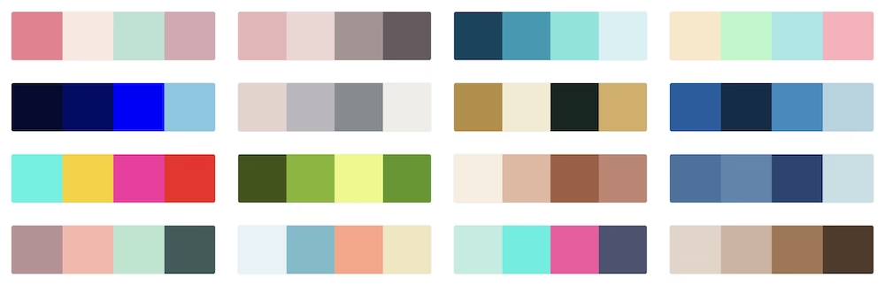
Strategic Use of Accent Colors
You want to use accent colors sparingly to make them stand out:
- Use your accent color for call-to-action buttons
- Highlight important information or offers
- Draw attention to crucial conversion elements
A/B Testing with Colors
The effect of colors can vary depending on your specific audience and context. That’s why it’s important to test your color choices.
Note: this type of testing is mainly relevant for websites such as online stores with large sales volumes. For example, a freelancer’s site offering coaching services, this process may not be worthwhile.
What to Test
- Call-to-action buttons
- Background colors of important sections
- Text colors
- Header color
- Color of price tags or offers
How to Test Effectively
- Test one color change at a time
- Gather sufficient data (at least a few hundred interactions)
- Look beyond just click-through rates – also measure follow-up actions and conversions
- Test on different devices (colors may appear differently on different screens)
Tools and Resources
There are countless tools available to help you choose colors for your website.
Color Palette Generators
- Adobe Color: Create color schemes based on color theory
- Coolors: Generate color palettes with one click
- Colorhunt: Discover modern color palettes
Color Management Tools
- Colorzilla: An eyedropper tool to pick colors from websites
- Color Safe: Generate accessible color palettes that comply with WCAG guidelines
- Accessible Color Matrix: Test different color combinations for accessibility
Avoiding Common Mistakes
Using Too Many Colors
Use colors sparingly for your website. Stick to a maximum of 3-5 main colors in your scheme. More becomes cluttered.
Poor Readability Due to Insufficient Contrast
Low contrast ratio between text and background is not only an accessibility issue but also makes your content harder to read for all users.
Blindly Following Trends
It’s important to stay up-to-date with design trends, but don’t just choose the latest design trend that doesn’t fit your site. Your color strategy should be based on your brand identity and audience.
Conclusion
Choosing the right colors for your website influences brand perception, user experience, and conversion rates. So take the time to study and think carefully about it.
This guide provides a handy starting point.
Remember that color is a powerful communication tool that goes beyond aesthetics. It affects how people perceive your brand, how they navigate your website, and ultimately whether they decide to engage with you.
Start with a clear understanding of your brand and audience, choose colors that enhance your message, and regularly test and refine your color strategy.



Leave a Reply